Designing for growth
CONSUMER · MOBILE FIRST

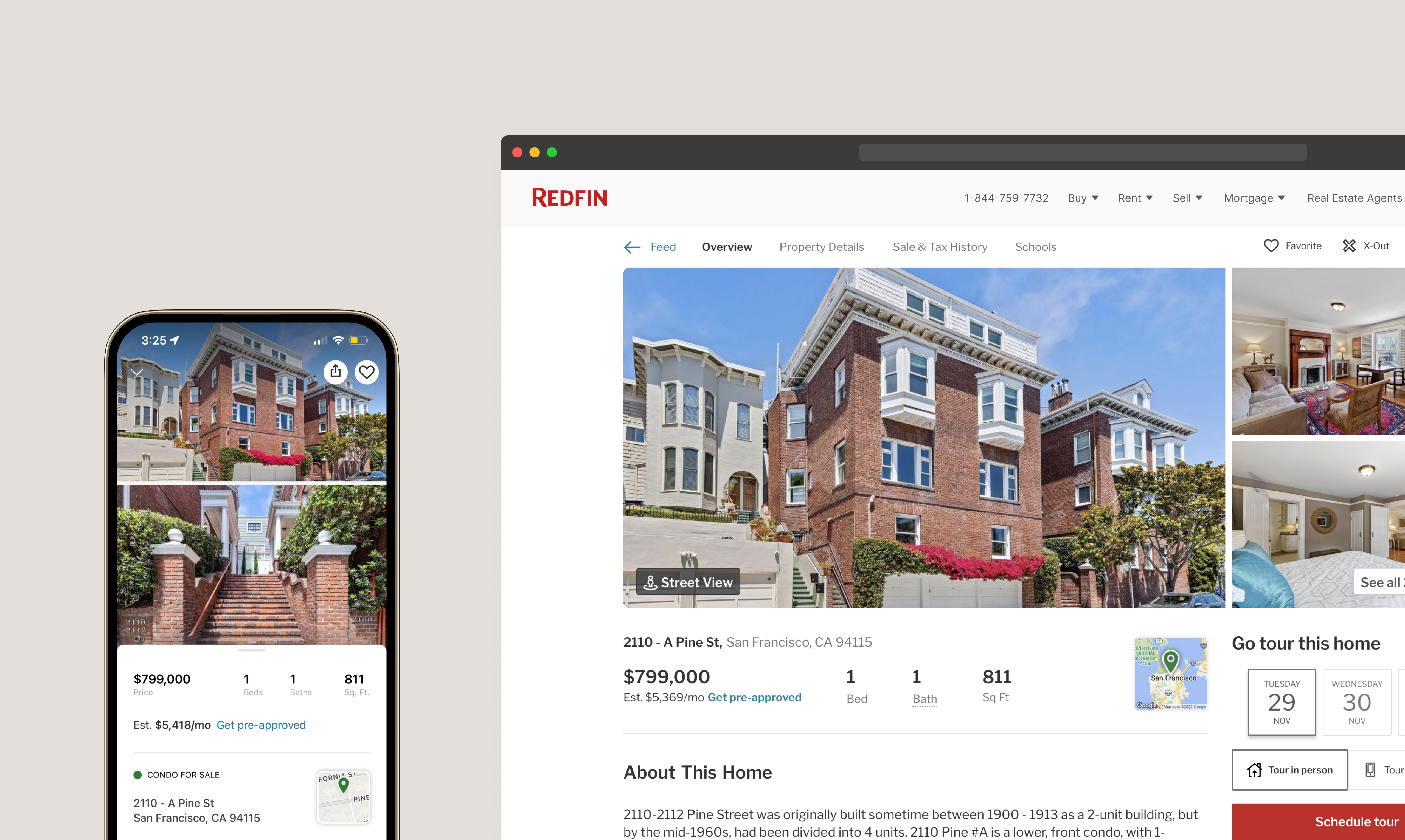
Redfin is where people go to browse homes and connect with real estate agents, and our listing page plays a huge role in that discovery. To ensure that connection was resonating with potential homebuyers, we focused on promoting the value of working with our agents when purchasing a home. Below you'll find a collection of work during my time at Redfin.
CONTRIBUTION
Responsible for in-depth research, end-to-end design, experimentation, a/b testing
TEAM
PM, Data, Engineering, Research, Leadership & Operations
TIMELINE
Varies
JUN — AUG 2022
Improving first impressions and instilling trust
Redfin does a great job of connecting homebuyers with our large network of real estate agents. This connection usually happens in less than seven minutes. Unfortunately, our customer hand-off process wasn’t the most helpful or clear — which left most agents feeling rushed and uninformed. We simplified this three-step flow by removing the clutter and prioritizing the most important information — like price, address and date.
Impact: Agents felt more confident in their decision making, and we gained a 9% increase in customer retention. This also increased the number of requests connected in less than seven minutes from 40% to 60%.
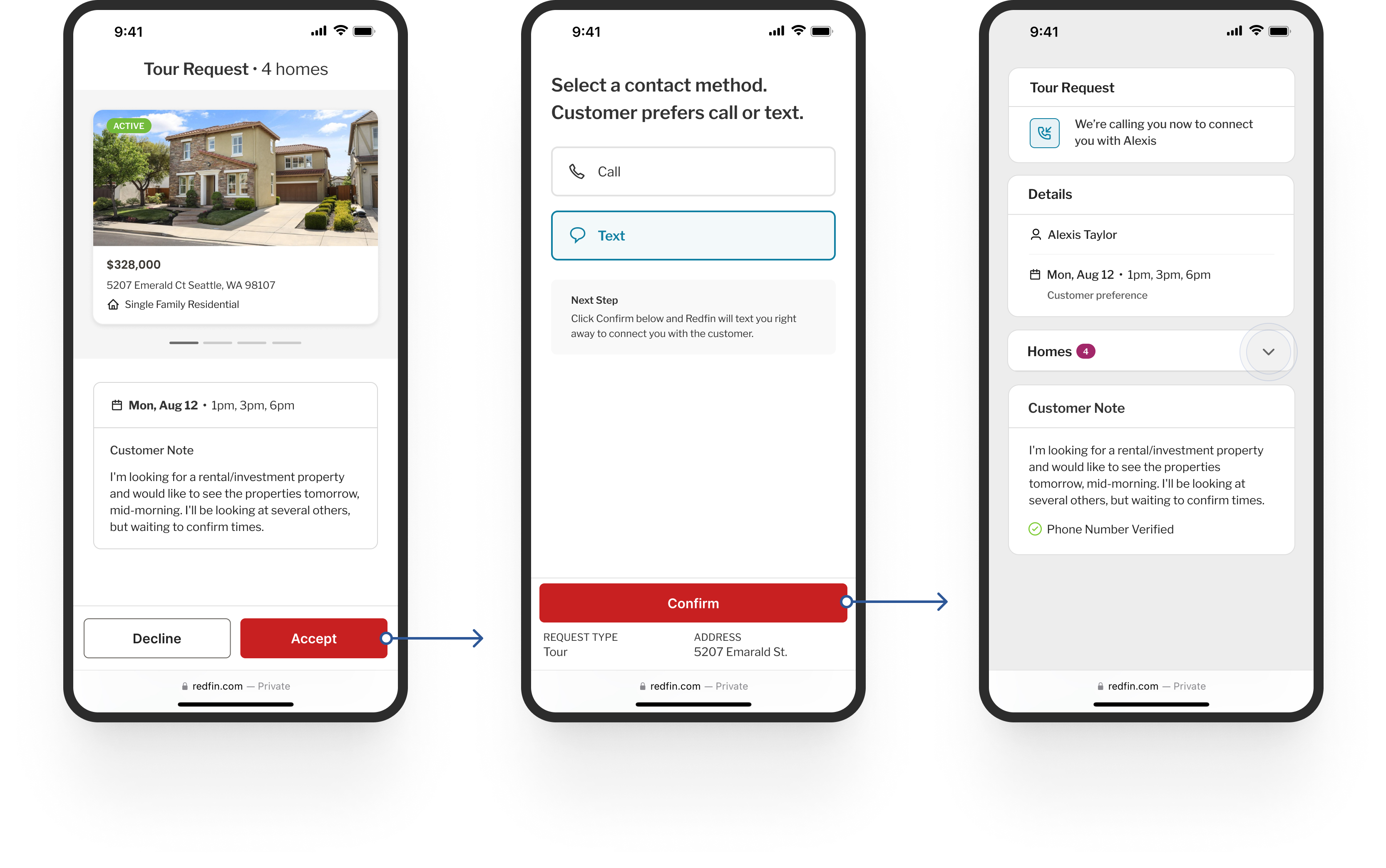
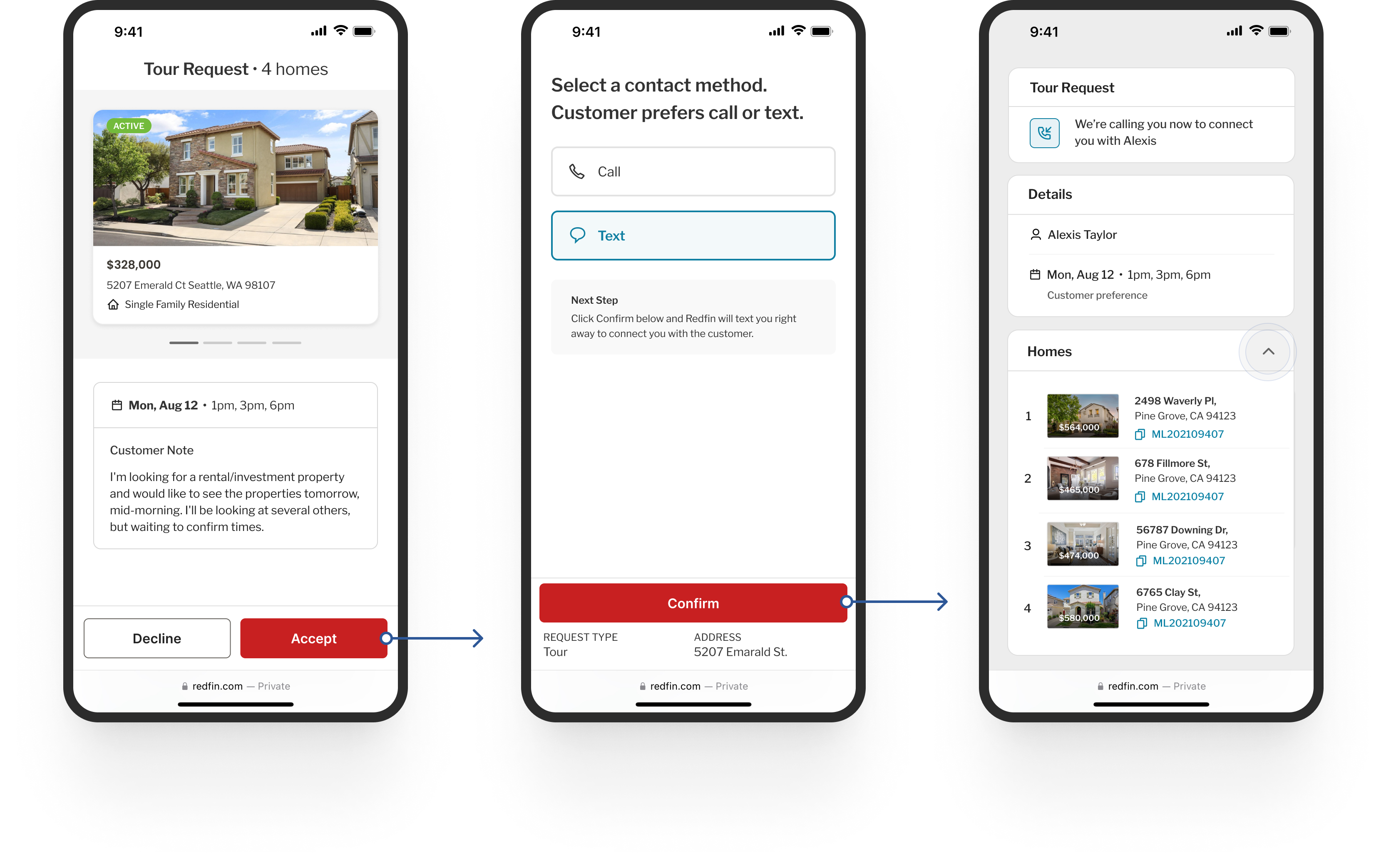
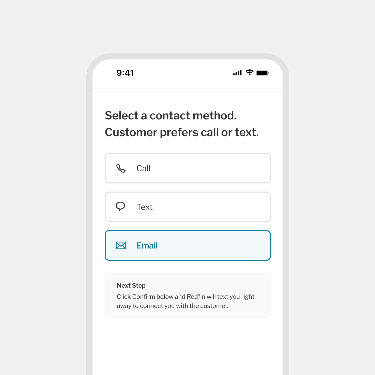
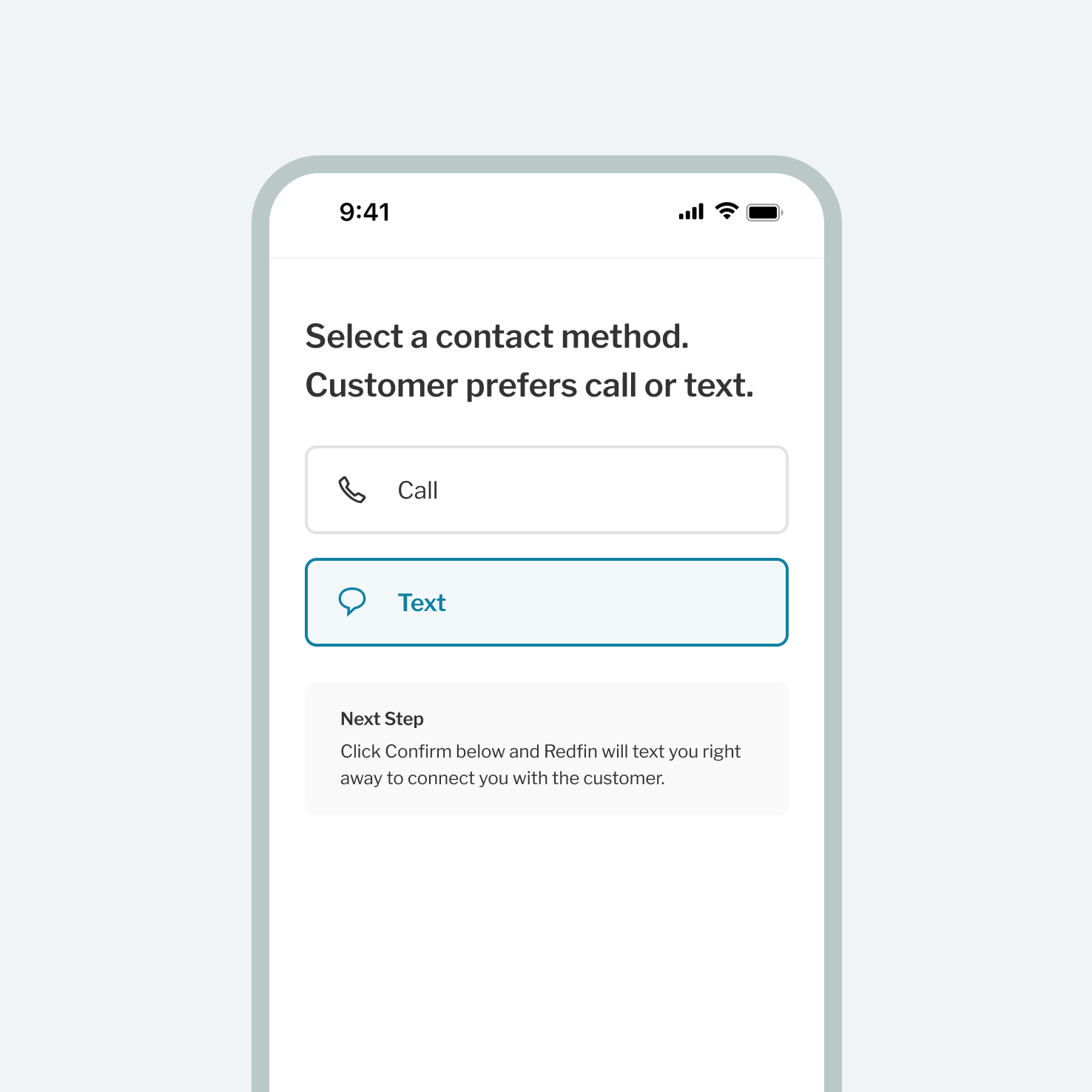
We also updated the contact flow to only include a customer’s communication preference. For example, if a customer selects text, we removed call and email from the options so that Agents match the user’s preferences.
This small change helped increase customer retention by 5%.
JULY 2022
Small changes, big impact
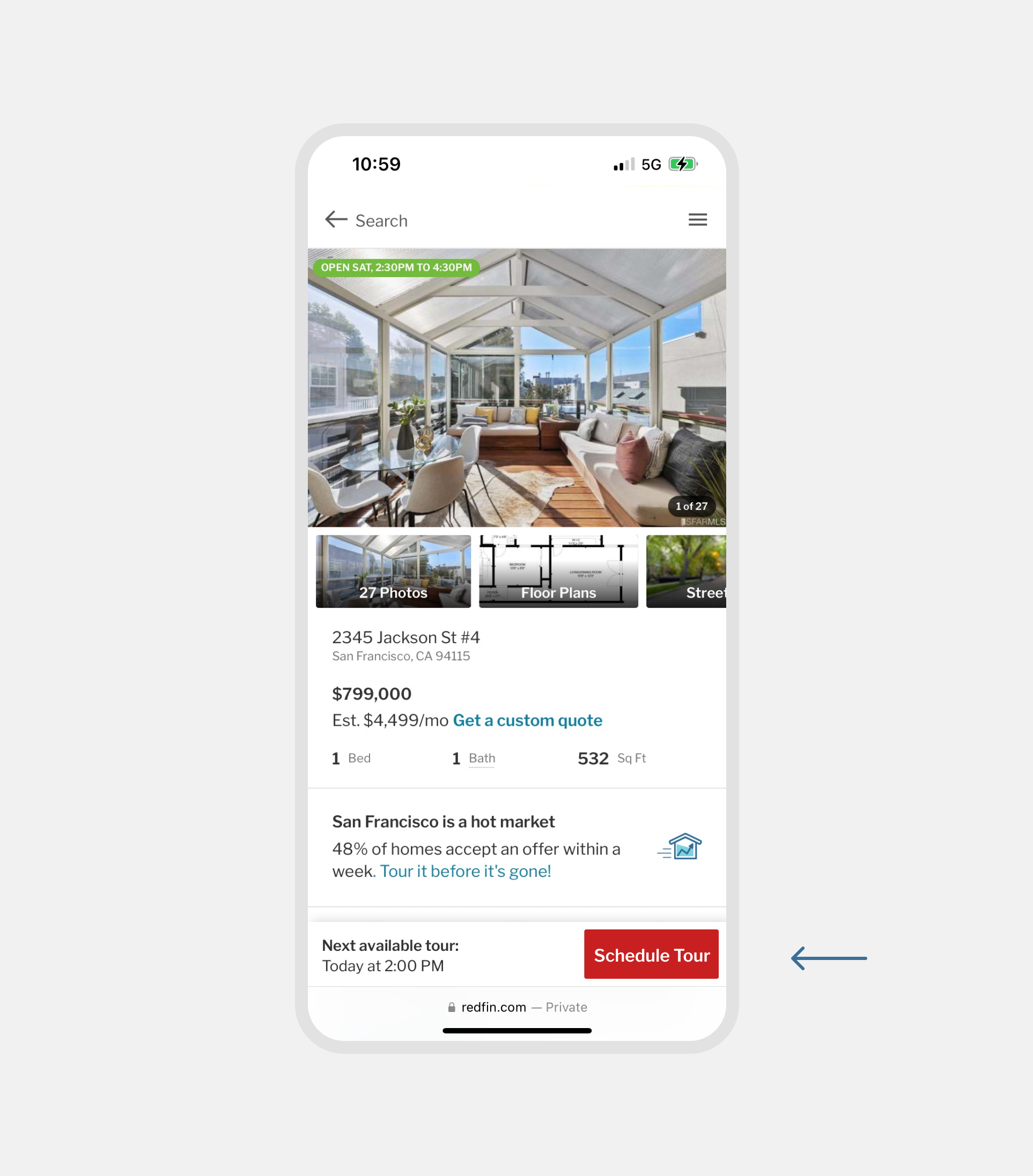
For a real estate website, it’s important that the experience meets a certain level of quality when it comes to its presentation. A thoughtful, well-crafted experience transmits a message of a trustworthy product. This was true for our most important call-to-action button. We simplified our sticky footer and this helped reduce some of the cognitive load while scrolling our listing pages.
Impact: Making the button more prominent within the footer improved retention rate by 5%. This added a +240 contact gain per month which equates to a $500K revenue gain per year.
JUN — AUG 2022
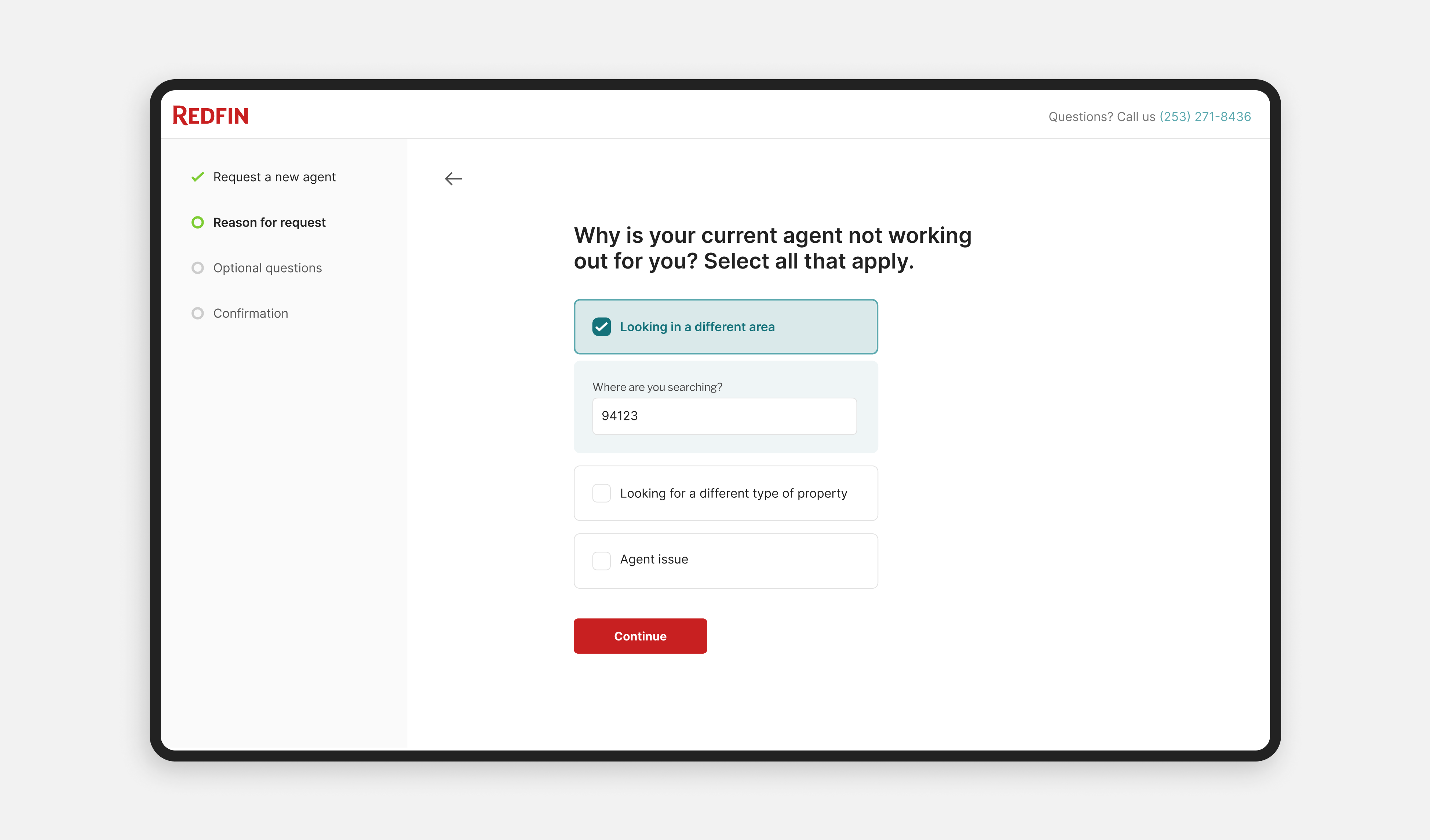
Making it easier for users to switch their assigned agent
Users often make mistakes or change their minds. Allowing them to undo their last action and go back to the system’s previous state is vital to building a great user experience. For this reason, we made it easier for users to switch their assigned agents or remove them from their account.
Other misc work
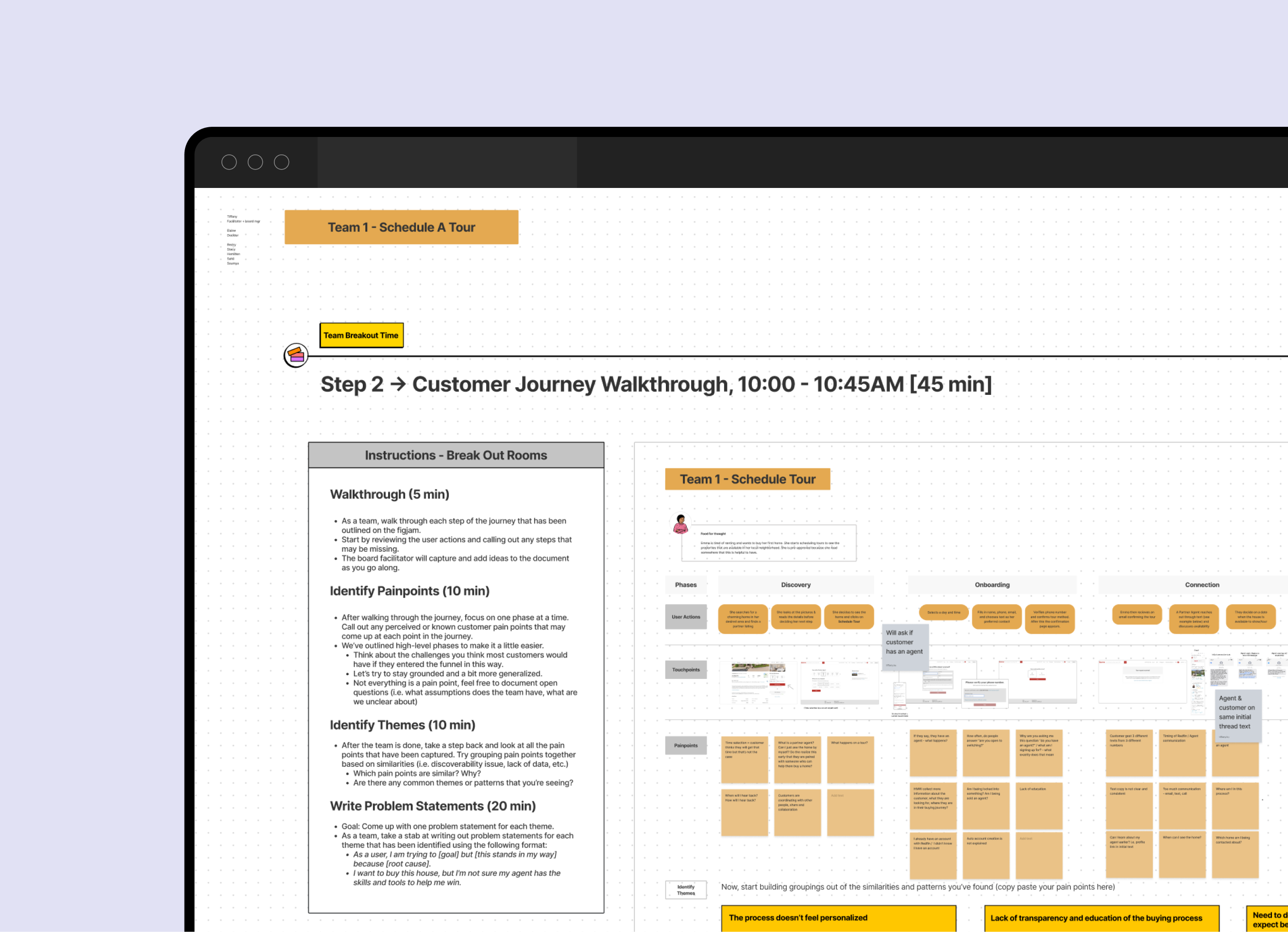
Partner Growth Workshop
I helped facilitate and co-design a workshop with various stakeholders. This created alignment and direction for our 2022 Roadmap.
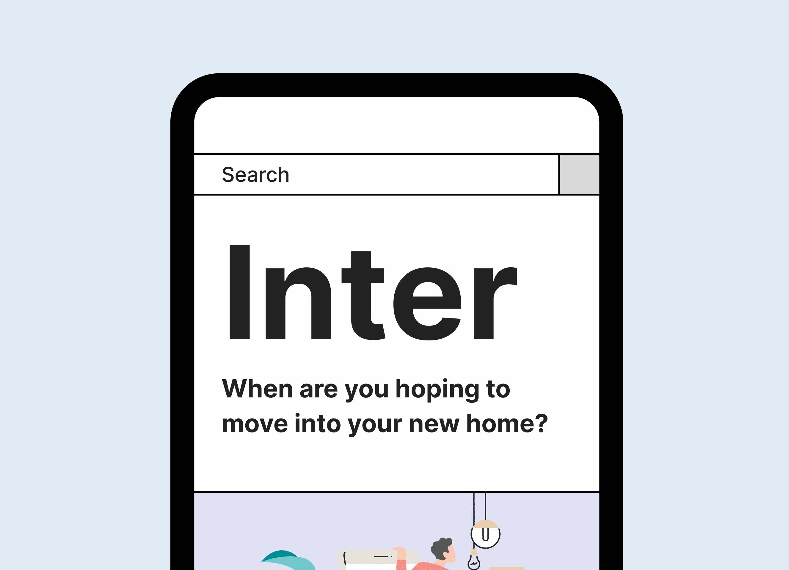
Redfin’s new typeface
I was also part of a working group in charge of identifying the next variable font for Redfin’s new design system. Presented final proposal to execs.
